Greed Reimagines Korean Tradition in Bold Compositions
Seoul tattoo artist Greed reinterprets Korean heritage through bold compositions in black & grey, and subtle color accents.

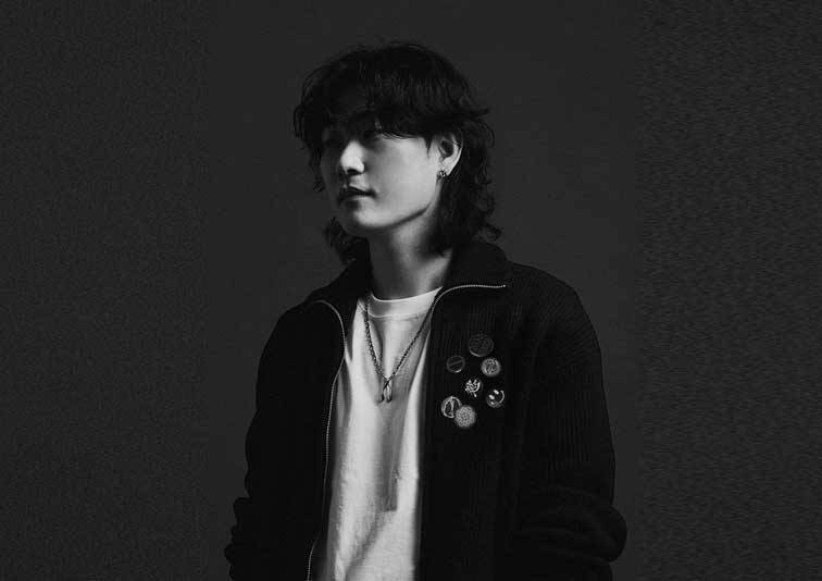
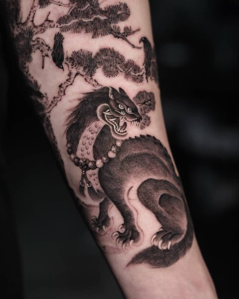
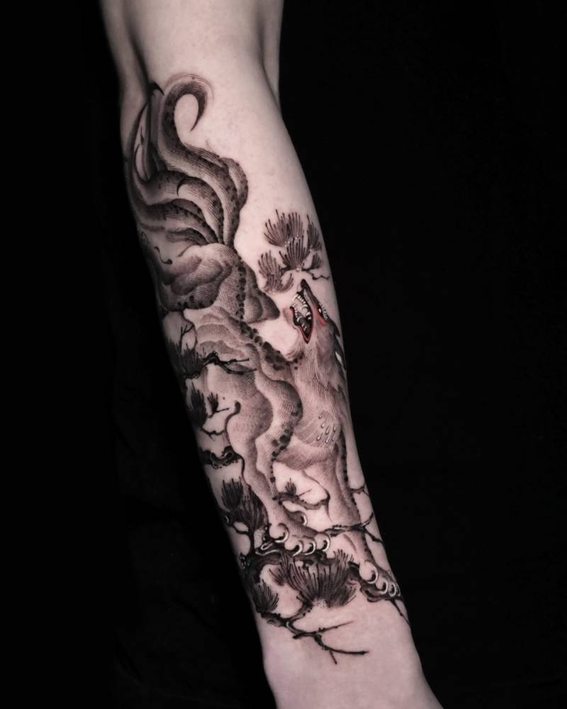
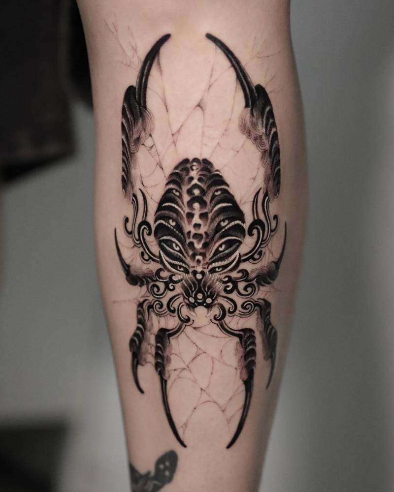
Born and raised in Seoul, tattoo artist Greed builds powerful compositions rooted in Korean heritage and contemporary tattoo language. His work blends traditional Asian influence with modern structure, creating pieces that feel both timeless and current.
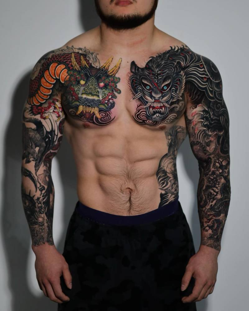
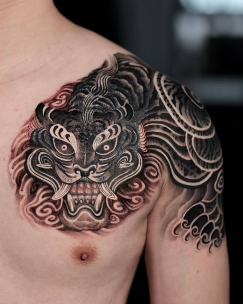
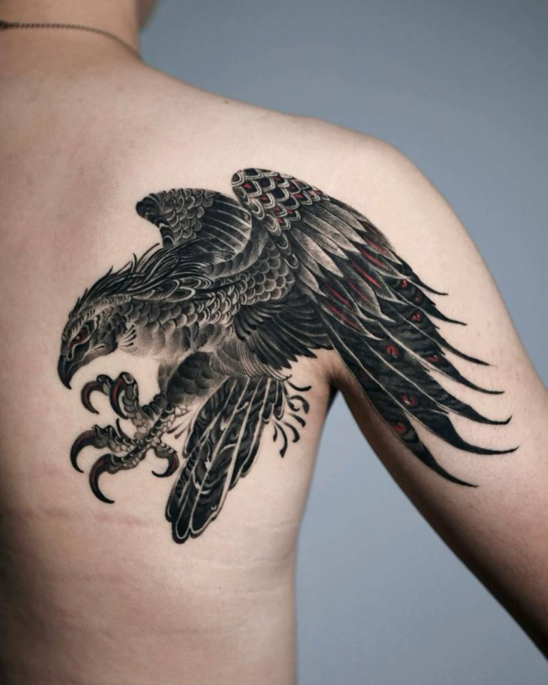
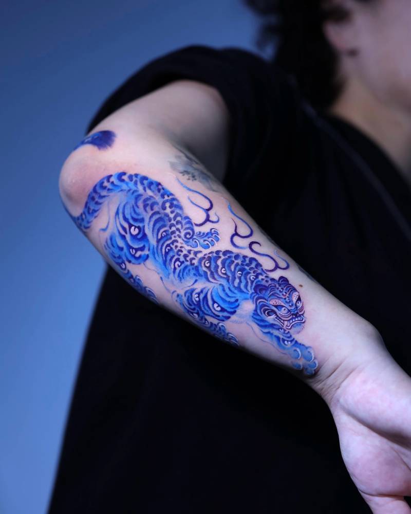
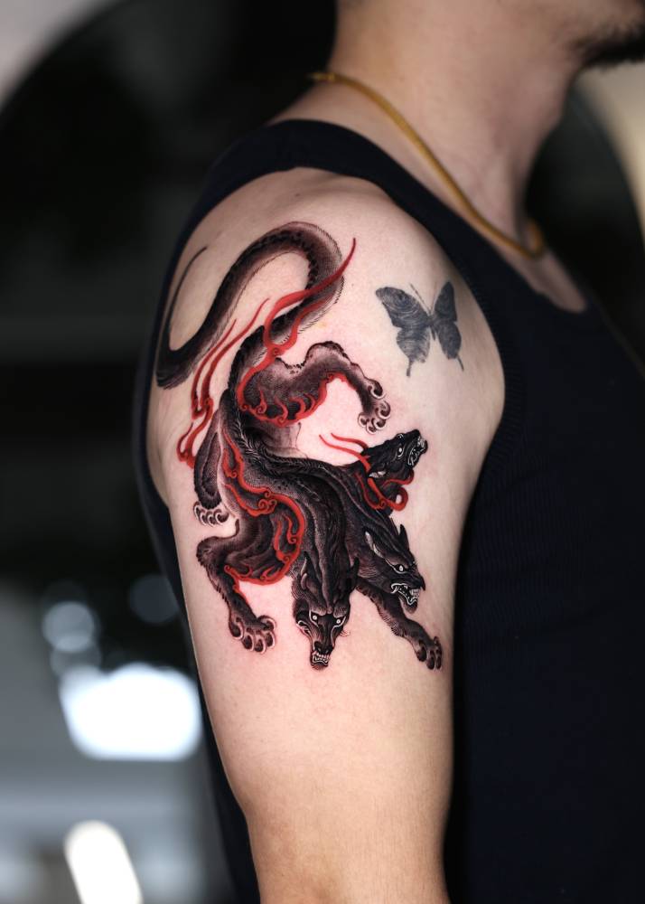
Although widely recognized for his strong black-and-grey compositions, Greed also incorporates controlled color accents—often red or blue—to enhance depth, symbolism, and atmosphere. Rather than relying on heavy saturation, he uses color strategically, allowing it to elevate the emotional tone without overpowering the structure.
His journey into tattooing began in 2020, not from an initial desire to work on skin, but after repeated requests from people who wanted his illustrations permanently on their bodies. Meeting PITTA marked a defining moment in his transition from illustrator to tattoo artist.
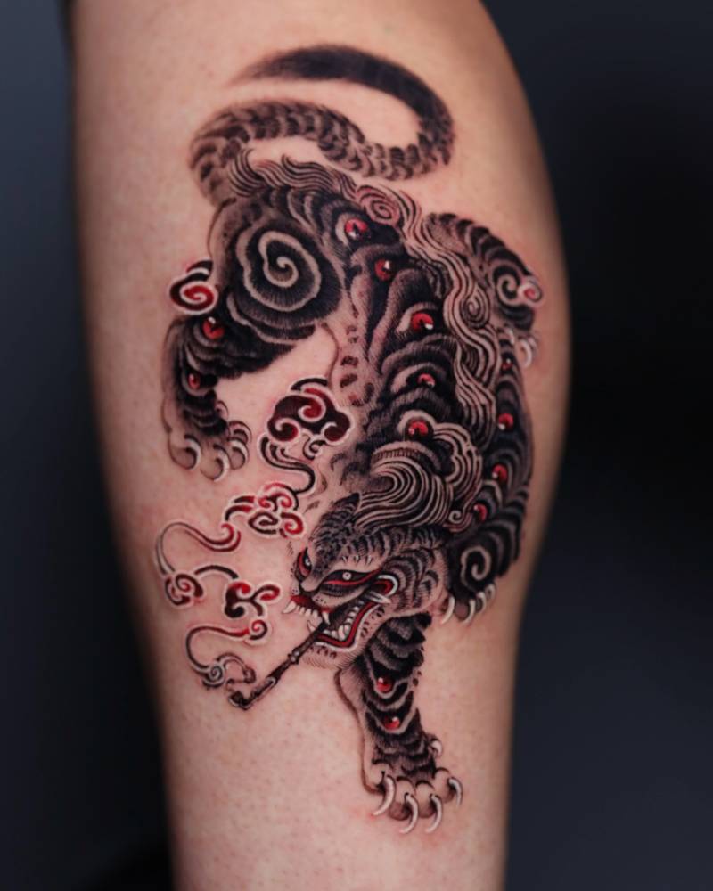
Symbolic animals—tigers, dragons, hawks, wolves—frequently appear in his work, representing guardianship, strength, and spiritual presence. His creative breakthrough came in 2022, the Year of the Tiger, when one of his tiger compositions resonated strongly with audiences and helped solidify his artistic direction.
Rather than replicating traditional Korean art, Greed reinterprets it. He believes culture must be lived to be expressed authentically, and his work reflects that philosophy. Now working at PITTA KKM / MIZANGWON Studio in Seoul, he maintains a deliberate pace, prioritizing depth, intention, and long-term growth over speed.
His goal is simple but powerful: ten solid years of steady, meaningful work—without rushing, without burning out.
You are known for strong black-and-grey compositions, but you also use color selectively. How do you decide when a piece needs color?
Most of my work begins in black and grey because structure comes first. When the structure is strong enough, color becomes a choice rather than a necessity. I use color only when it carries symbolic meaning or when it helps guide the viewer’s attention. To me, color works like a small accent in music. It should highlight the structure rather than dominate the composition.
What does red or blue add emotionally or symbolically to your work?
Red often represents energy, vitality, and intensity. In many Asian visual traditions it can also symbolize power or spirit. Blue creates a different atmosphere. It introduces distance, calmness, and quiet tension. I do not use color simply as decoration. I see it as a layer that adds emotional atmosphere on top of the structure of the work.
How do you prevent color accents from overpowering the structure of your designs?
I treat color almost like punctuation. The drawing and composition should already be complete even without color. If the structure collapses when color is removed, then the design was not strong enough in the first place. Because of that I keep the palette minimal and place color only where it strengthens the flow of the composition.
In 2022, the tiger became central to your portfolio. What did that subject unlock in your visual language?
The tiger opened the door to my own artistic world. In Korean culture the tiger is not only a symbol of strength but also carries humor, spirituality, and folklore. Working with this subject allowed me to explore movement, expression, and narrative more deeply while also bringing me closer to my cultural roots.

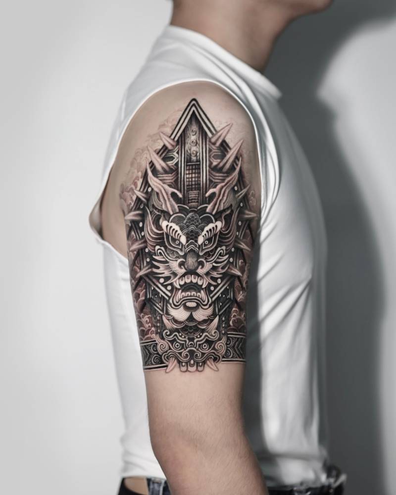
Your dragon half-sleeve inspired by Ilwolobongdo is highly recognizable. What made that piece a turning point?
That piece was the first time I fully interpreted traditional imagery through my own perspective. Instead of reproducing historical references directly, I tried to translate the spirit of Ilwolobongdo into a tattoo composition. Through that process I realized that tradition does not need to be copied. It can become the starting point for new interpretations.
Many artists replicate traditional Korean imagery directly. Why do you choose reinterpretation instead of restoration?
I see tattooing as a living medium. When historical images are reproduced exactly as they are, they can lose their connection to the present. Reinterpretation allows tradition to continue breathing within a contemporary context. My goal is not to preserve the past exactly as it was but to continue its story in a new form.
You describe your style as “Oriental” for simplicity. If you had to define it more precisely, how would you describe it?
Most of the inspiration I receive passes through the perspective of being an East Asian artist. My visual culture, philosophy, and background naturally filter the way I interpret imagery. That is why I sometimes describe my work simply as Oriental. Over time, however, I hope to reach a point where my own name becomes the genre itself.
You consciously avoid overbooking clients. How does that slower rhythm impact your creativity?
Tattooing can easily become mechanical if the volume becomes too high. By keeping a slower rhythm I give myself time to think more deeply about each design. That space allows ideas to mature before they become permanent on someone’s skin.
How has working at PITTA KKM / MIZANGWON shaped your artistic development?
Working in that environment allowed me to observe many strong artists with different approaches to tattooing. Being surrounded by that kind of energy pushes you to constantly refine your own work. It taught me that technical skill is important, but in the end what defines an artist is their direction and their voice.
Your long-term goal is ten strong years in tattooing. What would success look like at the end of that chapter?
For me success is not about popularity or the amount of work produced. If after ten years my work still feels honest and recognizable as my own voice, that would be enough. I want to leave behind a body of work that shows clear evolution while staying rooted in the ideas that first made me start tattooing.
